Saturday, May 2, 2015

Simpify


Such a hard lesson to learn and we hear it all the time. Simplify. What are you trying to say? Do you really need that tree or that branch? Does it add to my design or is it distracting? We all know less is more. A painting is much more interesting if you don't give out all the information, you must give the viewer some credit. He knows it's a tree, he doesn't need to see every branch. There is more mystery in not defining every object, more imagination and creativity for you and more engaging for the viewer.
It’s impossible for an artist to paint every twig or pebble; those details are best left for the photographer. We must figure out how to best show it with shapes and patterns, using brush strokes, design and mood.
 
I really liked the way this painting was turning out but did I really need that background? Was it important for my overall message? If I needed it to look like Athabasca Falls, then maybe, but I had already changed the rocks so it really didn't matter. And no, it wasn't important. I took a photo, went to my computer and Photoshopped the background out. Yes I liked it much better. So, a few swipes with my large palette knife and it was gone. A simplified adjustment.
 
From a distance this painting looks very detailed and representational, but up close you can see from the strokes that it is implied detailing with abstract designs.  'The calming Force', acrylic 24 x 36 inches

Wednesday, April 29, 2015

Keeping It Fresh


Have you ever had one painting that has received more attention than any painting you have ever done? In 2010, I painted 'Sunwapta Roars', and to this day it still receives accolades. Many times I have painted Sunwapta trying to recapture that 'something', and although they were all very successful paintings, I never quite achieving that same freshness.

I have been asked to do a article and show my process of a waterfall for a major art magazine ( more on that at a later date). I decided to do Sunwapta Falls with the goal to keep it fresh...not to over work it. Here is the result. 'Sunwapta In Motion',30 x 30. I quite like this one.


Uphill Cascade


Waterfalls are probably one of my favorite things to paint. I'm giving myself the exercise of using older paintings as my reference to try and veer off photographs. These type of paintings allow for much more freedom.

Sunday, April 26, 2015

I Like It much Better Now


This painting had been on my studio wall for weeks. I made a few delivery trips to the gallery and always held this one back. Something about it was bothering me, I wasn't sure what, but I knew I wanted it off my wall. Although I had wanted to simplify the water...it was boring, dark and dull. I also thought the red was too red. So I needed to spice up the water without changing my focus, tone my red and lighten my shadows. I like it much better now. Acrylic 20 x 28

This next painting, many of you will disagree with me. Although there was nothing really wrong with it, I found it lifeless. It was too representational, boring and grey. No excitement. I reached out for a second opinion from my gallery owner/friend Wendy Wacko, and after some thought, she came up with a couple of recommendations. She pointed out that my back, middle and foreground all carried the same weight. She suggested I simplify the heck out of the foreground, use my imagination and make the mountain the star. Good advice. I ditched the photo and brought out my palette knife and dived right in...I had nothing to lose. Good bye to the trees. It was actually quite satisfying making up cliffs and edges. More mystery. I like it much better now. Acrylic, large 48 x 72. Not the best photo...must see in person.


Saturday, April 25, 2015

Andrew McDermott Pastels


The FCA Calgary chapter brought in Andrew McDermott ( current president of the FCA ) , for a pastel and acrylic workshop. Having never used pastels and being in the mood to try something different, I eagerly joined 13 other artists for a fun filled two days of pastel dust. It was nice to interact with other artists and get out of my basement studio, away from the stress of deadlines. I was thrilled to have a live model, something I want to do more of , but I realized fast that I needed a lot more practice with my drawing skills. We all did little exercises and various timed poses. The second day we did a step by step painting from the same photo.

As well a very talented impressionistic artist, Andrew was an excellent instructor and we all had a bit of fun. I even managed to learn about pastels. I look forward to doing more drawing and maybe some pastel painting down the road, but now my mini break is over and it's back to work I go. Thank you Andrew and my fellow participants for a great time.

To see more of Andrew's work here is his website  Andrew McDermott

Here are some of my, not so impressive studies, and the second day painting above.


Tuesday, April 21, 2015

More Little Ones


Two more little semi abstract landscapes. acrylic 9 x 12 and 16 x 8.

Monday, April 20, 2015

Time To Loosen Up.


I'm working on a series of paintings that I absolutely love to do. Be it waterfalls or mountains, I never know what will unfold in these small semi abstract paintings. Most of the time I won't use any reference or maybe a favorite painting to jump off from. Lots of gel, texture and glazing. I initially mixed a ton of various warm and cool greys with gel. I had so much that I ended up starting five paintings! ( can't waste all that premixing ). This is about as structured as I get, I do not have a set formula or method of painting. So I lay down the paint with a palette knife, sometimes with no idea in mind and sometimes with a vague one. I wait until the next day before I can continue. I will add more palette knife work, scumbling with brush or rag, and glaze, in no particular order, and see what emerges. Sometimes I will repeat this several times, sometimes the painting is done within minutes. Painting this was allows me the freedom to work within  the 'zone', not worrying about being realistic, deadlines or any other stressful things....so very satisfying.

Above is  one I completed this morning. acrylic 9 x 12. I did use a reference for this one.

By the way, one of my other 'abstracted' works, I just found out, made it into the top 15% in the Monthly Boldbrush contest. 'Cascading Abstraction', 12 x 12. see below.


Sunday, April 19, 2015

Wooded Meadow


 Here is my larger version of my previous study, acrylic 48 x 48 inches. Hmmm.... now that I'm looking at it...maybe more flowers/foliage in the foreground?

Thursday, April 16, 2015

Wooded Meadow Study


Well, it wasn't exactly a meadow....more of a clearing. Referenced from the Vermillion Lakes road, in Banff in the late Fall. acrylic 20 x 20 inches, a study for a much larger painting. Here is original photo and the cropped/enhanced one.


Wednesday, April 15, 2015

Color Along The Bank


A large 48 x 48 acrylic. I have a solo show coming up in May and I really want to add some warmth  to my paintings as lately I seem to be doing a lot of cool colors and winter scenes. This particular one metamorphosed from my original intent so I ditched the reference. It's not quite done, but it has taken a long time to get to this point. I will do more along this vein to workout my struggles.

Thursday, April 9, 2015

Couldn't Help Myself


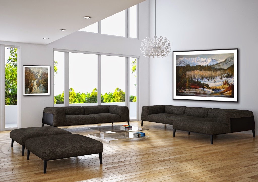
I couldn't help myself, I just had to add more. If anyone is interested in seeing what my art would look like in your home, please send me a photo of your room. It really does give you a better idea of what it would look like, relationship, color, scale, and framing options. I also increased the size on two of my paintings to see how they would look in a larger scale. ( first image )


Cool App


How cool is this? Love seeing how my art looks to scale in an actual room setting. IArtView is an app for IPad and IPhone which I'm trying out for 1 month. No measuring involved, move the paintings, change the frames and upload your own rooms and more. May be a good marketing tool for artists/galleries. Having so much fun playing with this....ok back to work.


Tuesday, April 7, 2015

Where Bow Meets Spray


Very large acrylic 48 x 72 inches.
Where the Bow River meets its tributary, Spray River, near Bow Falls Banff. Based on my small previous study. It really is a task to try and keep the large painting as fresh as it's study, and I found myself getting caught up once again in details. Even with my large palette knife I could feel myself tightening up. I had to force myself to stop painting.

Monday, March 30, 2015

Bow River Banff


Bow Falls in Banff is a big attraction for tourists, and although I enjoy looking and listening to it, I have never been that moved to paint it. The scene off to the right, however, I have always wanted to paint. Yesterday I took a friend who had never seen the falls and the light was just perfect. I really liked the way the light bounced off the side of the mountain and the
contrast of the snow and shadows. While fresh in my mind I decided I would paint it. One smaller one and one huge one. This is my smaller study, 24 x 24  and my under painting for my 4 ft x 6 ft.


Saturday, March 28, 2015

Johnsons Creek


Most people when they go to Johnsons Canyon, hike up to the falls. My knees were bothering me that day, so I decided to go the other way and follow the banks of the creek. The light bouncing off the creek and the bank was so illuminating! My wish was to capture that brilliance. This is the larger 30 x 60 canvas based on my earlier study.

Thursday, March 26, 2015

Little Studies


Here are two little studies I was playing around with. The paintings didn't take long to do but trying to photograph them took me forever. I'm not sure why, but the colors had a greenish tint to them and trying to correct in Photoshop took me literally hours. I tried outside, my studio, and other rooms and I still don't have it right. My internet on my computer is down and although I can edit, when I download them to the laptop they look so different. I suppose every computer/laptop/tablet screen will vary in color. It's no less frustrating. Soooo much better to see the work live.

Tuesday, March 24, 2015

Passing Stormy Banff


My other 48 x 72 inch painting. I took some liberties with this one. There were no foreground rocks in my reference photo, and the trees were much taller and hid most of the mountain. The foliage had some color but I just had to pump it up.

Thursday, March 19, 2015

The Bank of Vermillion Lake


A very large canvas, 48 x 72 inches. This is referenced from the vermillion lakes in Banff. I struggled with the sky color...blue, green, yellow, pink, stormy, bright? Settled on varying greys with hints of all of the above. I actually stayed away from my usual cadmium's and used a lot more Alizarin Crimson. Still needs a few details and touch ups, but will live with it a few days before coming back to it.

Tuesday, March 17, 2015

Voiters Flats

Here is my 'study' for a 48 x 72 larger painting. Referenced from a recent outing to Voiters Flats in Fish Creek Park, Calgary. Acrylic 20 x 28 inches.

Friday, March 6, 2015

Two Little Ones


Remember I had all that left or gel mixture in various greys? Well, here are the last two paintings from that day, applying the texture first. The paintings pretty much dictate how it's all going to unfold and it really is a satisfying process for me. These are yet untitled, 12 x 12 ( liking this one a lot...might just keep it), and 20 x 10 (before and after)


Thursday, March 5, 2015

Looming Louise


I felt like painting Lake Louise again...must be time for another road trip. Spring is near.
Acrylic 40 x 40

* Made some adjustments...much better don't you think?
Before:

Monday, March 2, 2015

The Transition


As I mentioned in my previous post, I had a lot of greyish gel mixture left over and splattered it on 5 canvases. As I was applying the greys on this one, I realized I really liked a lot of my under-painting and drips so decided to keep them.( and added more as well). As I started to paint, I decided to keep a lot of the initial palette knife greys as well for a looser more abstract feel. I call this , 'The Transition', 18 x 36 inches


Here is another, 20 x 10 inches 'Passage'. Before and after.